

01 / Olympia Sans
Look at the letters.
Before reading a headline, we notice its shape. The weight of a stroke, the space inside a letter and the rhythm across a line all give it a voice.
Look closely at the O, the narrow spaces between letters and the sharp ends of each stroke. Together, these details make a familiar word feel distinctive before its meaning has even registered.
A closer look
On One Olympia, the difference between fine and heavy strokes gives the large headlines their character. The letters feel sharp and deliberate. At this scale, the type becomes a visual feature in its own right.
The heavier strokes give the word its structure, while the fine lines leave room for light and space. That balance is particularly noticeable in the curved O and the diagonal strokes of the M and A.
Seen as a whole, the headline has a rhythm: dense shapes, open spaces and crisp edges working together.
Compare Light, Bold and Poster here. These are three separate styles used by the website, shown at the same height so the change in weight is easy to see.
02 / Type and space
A headline with a place to sit.
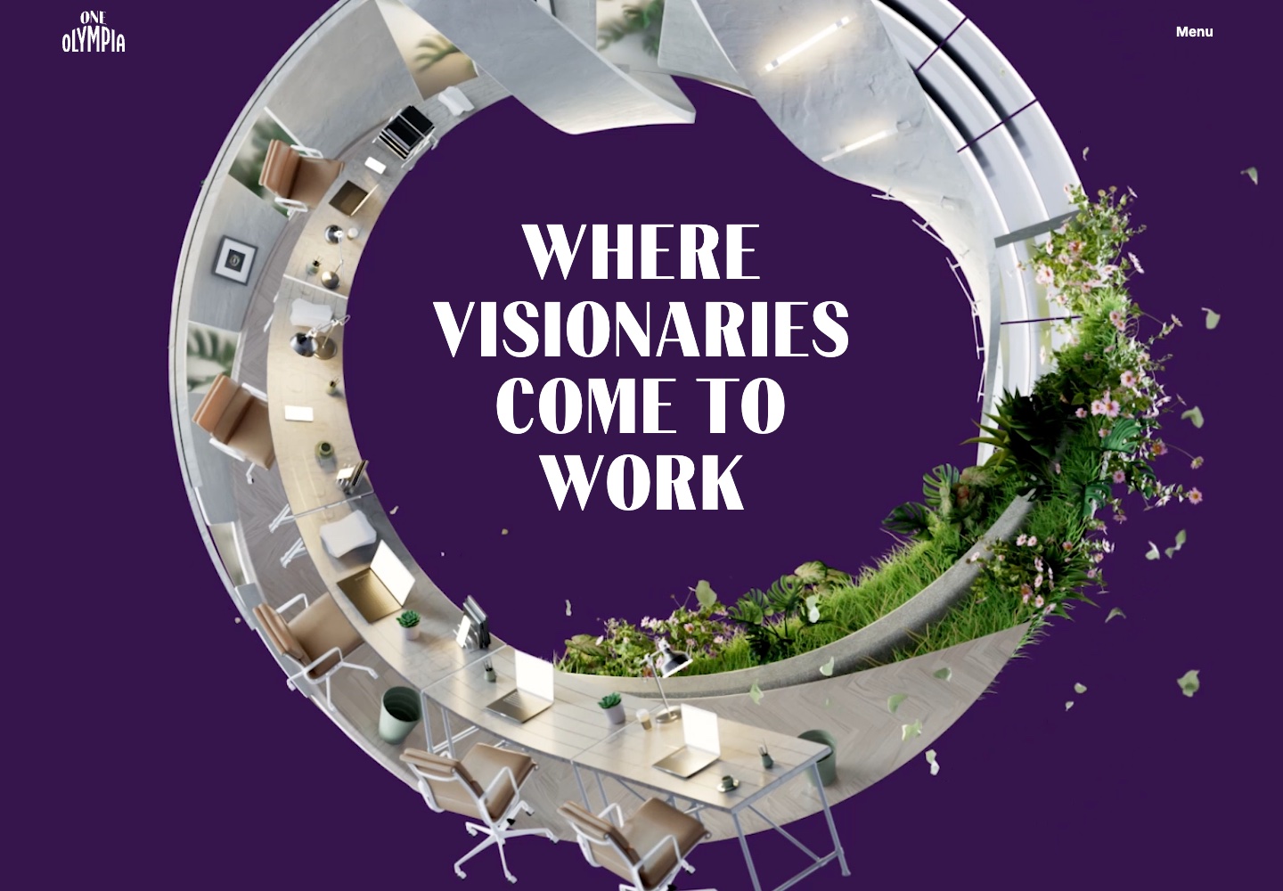
The opening headline is arranged in four centred lines, within the open centre of the architectural image. Shorter lines above and below the longest one make a compact shape inside the circle.
A closer look
Our reading of this composition is that the still lettering gives the moving scene a point of focus. The architecture supplies movement and detail; the headline holds its position.
This relationship matters more than adding movement to every element. Here, the contrast between still type and moving architecture gives each a clear role in the composition.
White lettering against deep purple gives this opening a different mood from the coral-on-white treatment elsewhere in the site. The relationship between type, colour and space keeps both treatments connected.
03 / Hierarchy
Give each style a job.
The homepage uses the Poster style for its opening statement and major section headings. Bold gives the large figures a strong presence of their own. Inter handles supporting information across the site.
That contrast lets the display lettering be expressive while practical information stays easy to read. A type system becomes useful when the differences tell us where to look and what to read next.
04 / On the web
The setting is part of the design.
Choosing a typeface is only the beginning. Line breaks, scale and the space around a headline change its effect. The same words can feel generous, awkward or crowded depending on how they are set.
For a website, those relationships have to survive a changing viewport. Preserving the character of a headline means paying attention to the whole block of text, as well as the individual letters.