
in colour.
The same words. A different emphasis.
01 / Colour
A palette can set the pace.
On The Wick, intense blue and pale pink create a recognisable opening. The blue has the presence of a sign; pink gives the editorial introduction a different register.
Colour carries across large areas of the page, so the transition is visible before a reader begins the next paragraph.
Try the palette
Choose one of the eleven original colour pairs. The words and their position remain the same; only the relationship between the foreground and background changes.
The study starts with Dark Blue on We Peep pink. Other pairs bring red against pale green, salmon against deep navy, or soft grey against black. Each changes the emphasis of the same words.
The colours and pairings come from the original palette supplied for The Wick. This study places the first colour in the lettering and the second in the background, rather than recreating a particular page. The website design is by Praline.
The useful question is where each treatment belongs: an opening, a collection, a story or a quieter area for reading.
02 / The opening
A recognisable way in.
The homepage brings the palette into a clear sequence: a black masthead on white, a blue statement across the page, then a pink editorial opening. Each change of colour marks a different part of the introduction.
A closer look
The blue band carries a short statement at full width. Below it, blue lettering on pink connects the editor’s letter with an Objects of Desire feature. The same two colours work at different scales.
The photograph adds texture and another point of interest. Its smaller footprint leaves the palette and typography visible around it, so the page still reads as one composition.
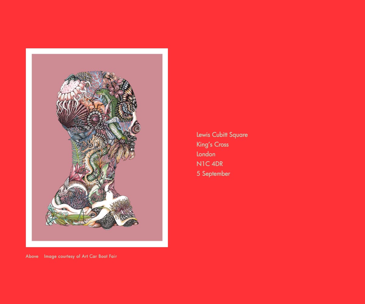
Hover over the image to move from the pink homepage to an Art Car Boot Fair feature. The vivid red gives the artwork a different setting, while the website’s familiar typography keeps the two views connected. Colour changes the atmosphere without needing to repeat the masthead.

03 / Editorial emphasis
Let the subject change the atmosphere.
The comparison above keeps the site’s structure familiar while colour and the featured image change. It lets us look at colour as an editorial decision, rather than as one fixed background for every page.
Try the supplied pairs against the same words before choosing a photograph. If a combination makes the lettering harder to read, its visual energy is not enough on its own.
04 / Consistency
Repeat the relationship.
A palette becomes useful when it has recurring roles. Repeating a few strong relationships can connect pages even when the photographs, headlines and subjects change.
The current site shows several story treatments. Our reading is that variety works because the masthead, navigation and editorial hierarchy remain recognisable. Colour adds another layer to that structure.
About this note
Website design by Praline. The original sitemap and supplied desktop/mobile designs date from 2020. The eleven colour pairs are reproduced from the supplied project palette. This note combines that palette and the documented editorial structure with observations of the live website in September 2026; interpretations of colour are our reading of the screen. Photography, artwork and editorial content belong to their respective creators. Explore The Wick Culture project.